23 February 2023

M6 Georeferencing, Editing, and 3D


This week's lab was quite the task of georeferencing, digitizing, and exploring the digital elevation model (DEM) of the UWF campus. We had to create a buffer for the eagle's nest fairly close to campus and the Escambia River. We created 330 and 660 feet buffers around the nest due to protection from any future expansion of the campus. This first map shows the DEM and buffer zones with the root mean square error data. 


This is the second deliverable map, also of the UWF campus. It involved loading a lidar file and converting it to a raster file. It also shows the digitized road and building layers, in yellow. The angle is looking northwest over the campus with a maximum elevation of around 255 feet, shown as a whiter color. I also loaded two jpegs making up the north and south part of the campus. They are draped over the DEM.

16 February 2023

M5 Geocoding School Addresses


 This map reflects geocoding results of Manatee County, FL schools, from the university to preschool. The data is courtesy of the Florida Department of Education where I added the data as a .csv file from Excel. It was interesting to create an address locator, use it to create feature classes, and add everything together to create a map to share. The process for this lab was a challenge and once reiterated how GIS tells me the errors of not following each step so precisely.

07 February 2023

M4 Campsites in National Forest


This week's lab was about creating buffers, buffer analysis, and creating unions. The resulting map shows possible campsites within a national forest. I excluded conservation areas in order to protect the flora and fauna from campers. The results are the available campsites outside of conservation areas. They show as color-coded polygon areas which show the results of prime areas for possible campsites. I chose equal interval for the method with three classes and three-step graduated colors of orange-reddish tones normalized with the percentage of total area. As the colors get darker on the scale the greater the area size with more potential for finding a campsite.


01 February 2023

M3 Final Projection comparison


The module for this week is creating a map showing the differences in coordinate systems that can show distortion for the same layers. This map compares Albers, UTM 16Z, and State Plane N for four counties in Florida. This as a final turn-in is a much better map than the previous one posted. I left the previous map post up to show how a map can look better, although not perfect, by adding some color and ensuring data are in straight lines for presentation. The "area in square miles" box has a white rectangle and I had trouble removing it but the information is still there.

30 January 2023

Projection Comparison


The module for this week is creating a map showing the differences in how coordinate systems can show distortion for the same layers. My map compares Albers, UTM 16Z, and State Plane N for four counties in Florida. I went with this side-by-side layout for a different layout than is typical. I concede there is too much white space on the map. This is not the finished product but I wanted to save this to show an unfinished map that could look finished. it needs more color and structure but is a good reference for comparison.

25 January 2023

UWF Main Campus with Florida Overview


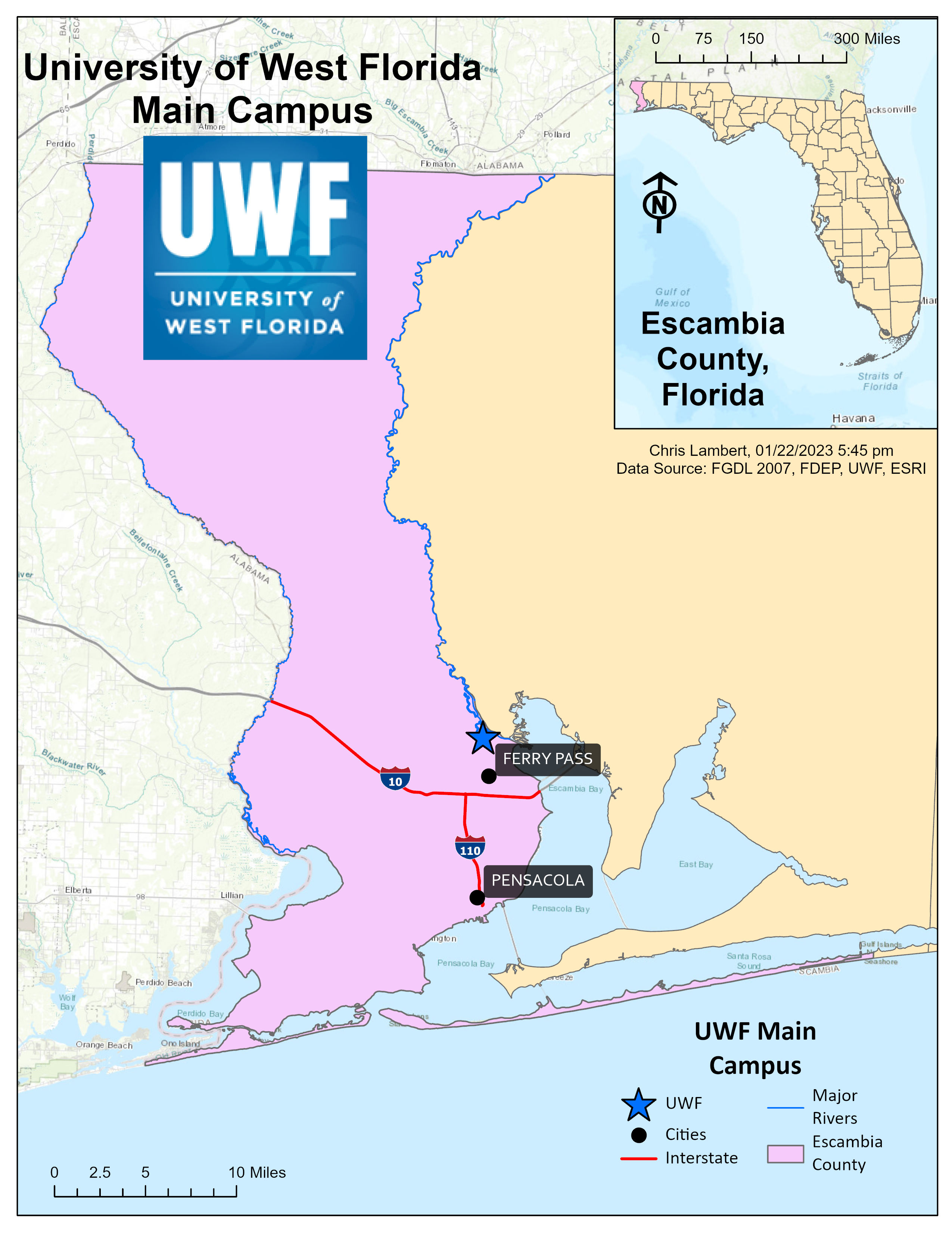
The map shows the University of West Florida campus in Escambia County tucked into the northwest part of the state of Florida relative to its other counties.

The process for the lab was extensive and detailed, as it should have been. The experience was one of repetition and just making sure to read the assignment ahead of doing the steps. ArcGIS Pro has a lot going on and it can be intimidating but a lab like this gave me more confidence going forward. I did have to repeat a few steps but doing so helped me. The creation of this map was a challenge in getting the inset map set up with the larger map. Details in choosing the location of the title, legend, and data source all affect the end result of what is being conveyed to make it easy for the audience to understand the map. It was a good challenge and fun to make. 

18 January 2023

ArcGIS Pro World Cities


This map was created with essential layers. It helped me get to know ArcGIS ensuring I use help and maintain patience in the learning process. The backdrop has too much white space and with darker colors, there is a lot of contrast. Seeing this output early will help guide me to a better map output.

UWF Student. Aspiring GIS Analyst.

Website and portfolio

For this blog post I will be talking about a part of my portfolio shown through my website which includes some examples of project work from...