This week’s lab was especially tough, I found. It was tough because of the time it took to work through the lab. The to also work through the challenges that naturally come with GIS and data. The objective was to practice the use of different visualizations techniques to present data as well as designing communication material combining maps and graphics. My end result is not pretty but was completed.
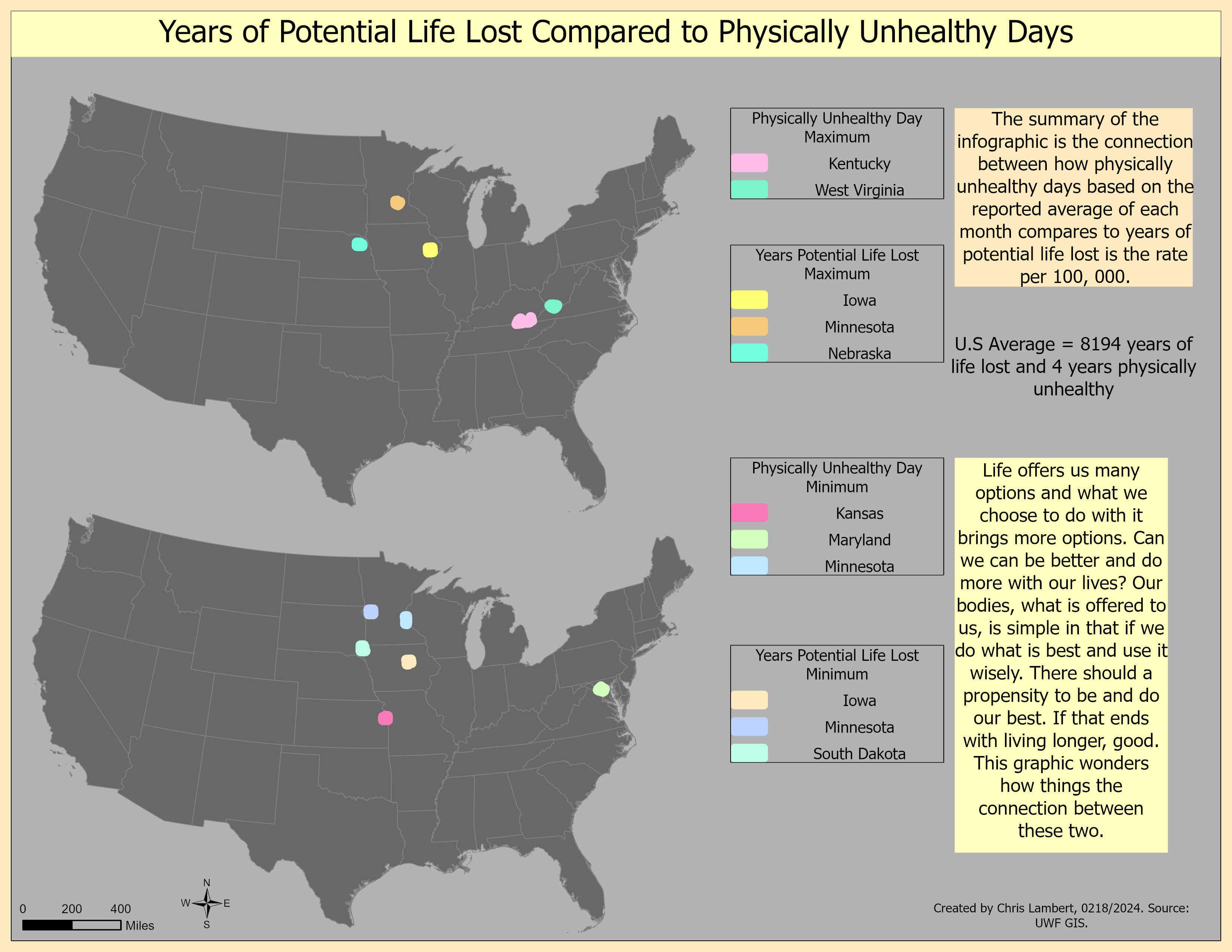
I had a challenging time with the layout and working with the design for scatter plot and bar chart. The data was downloaded from the Census Bureau in an Excel csv format. It was the 2018 County Health Rankings National Data, which is quite interesting. We picked two variables to work with and had to create an infographic with maps displaying the relationship between the two. Finalizing the layout is where I ran into some issues when creating one with so much information in it. Putting so much into one layout to convey the message in the data results, such as adding a bar chart with multiple inputs, and pie charts are a couple of them. This was the toughest lab I have had yet and especially to work within the time constraints.


No comments:
Post a Comment